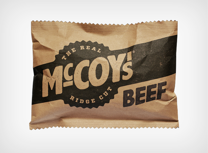
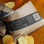
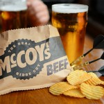
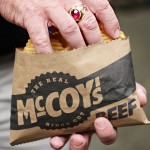
I think it’s fair to say that we pretty much grew up eating nothing but McCoy’s during the formative years of The Coolector i.e. when we were young whippersnappers and there are few variety of crisp which we favour more than this brand which is billed as being “man-chips” but, truth be told, the packaging does / did little to reflect the awesomeness of the crisp held within. Well, courtesy of skilled and respected branding agency, BLT Brands, all that may well be about to change with their new vision of how the crisp brand should portray themselves.
An update to the McCoy brand is long overdue in the eyes of The Coolector because, as far as I’m aware, they haven’t really changed their packaging since we first started chowing down on them in the 1990’s. Safe to say, the update doesn’t disappoint and we’re looking forward to getting our hands on some of these brilliantly redesigned packets should they hit the market any time soon. Take a look at some of the excellent branding work of BLT Branding and their work on McCoy’s below:

The chaps at BLT had this to say about their branding project for McCoy’s:
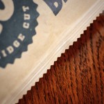
The big idea wasn’t in the graphics, but in the structure of the packaging. We decided that the bag should open on its longest side, contrary to conventional chips bags. This means the bag remains exactly the same size as before, but the opening is extended by a whole two inches, making it the ideal pack for big-handed men.
You can find out more about the superbly skilled branding agency behind this redesign over at BLT Brands.
- Rumpl Everywhere Mats - April 26, 2024
- Bang & Olufsen Beosystem 9000c CD Player - April 26, 2024
- Buckle & Band Milanese Stainless Steel Luxury Apple Watch Strap - April 26, 2024